Table of Contents
Introduction: Color also sells
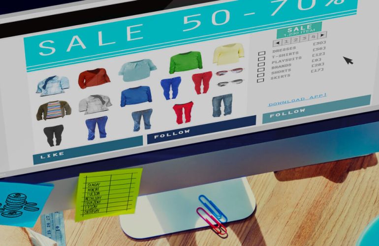
Did you know that 85% of consumers say that color directly influences their purchasing decision? Color plays a crucial role in all of this.
In this article, I explain to you, clearly and directly, how to use colors strategically on your website to generate more trust, stand out, and sell more. Welcome to the fascinating world of color psychology in marketing.
What is color psychology in marketing?
The psychology of color in marketing is the study of how colors affect consumer perception and behavior. It’s not just aesthetics: colors activate emotions, impulses, and unconscious associations that influence our decisions.
That’s why big businesses don’t choose their colors at random: they do it thinking about what they want to convey and provoke.

Why do colors influence purchasing decisions?
Because the human brain processes color before text or images. In fact:
-
Color can increase brand recognition by up to 80%.
-
Improve the readability, usability, and conversion of your website.
-
Generate immediate emotional reactions.
This is especially important for the first impression. You have only seconds to capture attention. And color, used well, can be your best ally.
Colors and emotions: what does each one convey?
Let’s see a quick guide to the most common colors and their emotional impact:
🔴 Red
-
Emotion: urgency, energy, passion.
-
Ideal for: promotions, CTAs, fast food, and offers.
-
Danger: can be aggressive if abused.
🔵 Blue
-
Emotion: confidence, security, calm.
- Ideal for: banks, technology, professional services.
-
Widely used in: sectors where credibility is key.
🟢 Green
- Emotion: health, freshness, balance.
-
Ideal for: organic products, wellness, finance.
-
Versatile and relaxing.
🟡 Yellow
-
Emotion: optimism, joy, energy.
-
Ideal for: capturing attention, generating a positive feeling.
-
Use sparingly: can saturate.
🟠 Orange
-
Emotion: enthusiasm, action, creativity.
-
Ideal for: e-commerce, CTAs, promotions.
-
Convey urgency without being as aggressive as red.
⚫ Black
-
Emotion: elegance, luxury, sophistication.
-
Ideal for: fashion, luxury, premium design.
-
Beware of using it as a background if there is no good contrast.
⚪ White
- Emotion: simplicity, cleanliness, clarity.
-
Ideal for: minimalist design, technological products.
-
Very useful as a background color.
💡 Pro tip: Use combinations with contrast and harmony A color does not work alone; its effectiveness depends on the whole.
Recommended colors according to your business type
Here is a practical guide to choosing colors to sell more, according to your business type:
| Business Type | Recommended colors |
|---|---|
| Online stores | Orange, Red (for offers), Blue |
| Professional Services | Blue, Grey, White |
| Healthy Eating | Green, light brown, white |
| Technology and Software | Blue, white, black |
| Cosmetics and beauty | Pink, white, gold, purple |
| Education and training | Blue, green, yellow soft |
| Fashion and luxury | Black, Gold, Grey |
Remember: it’s not just what you sell, it’s how you want it to be perceived.
Common mistakes when choosing colors on a website
Many businesses make mistakes like:
-
Using too many colors creates confusion.
-
Not thinking about the consistency with the brand.
-
Forget contrast and make reading difficult.
-
Copy competitor colors without analysis.
🎯 Color should be a strategic decision, not an aesthetic one.
How to choose colors for your website step by step
Here’s a guide to defining your ideal color palette:
-
Define your brand’s personality
Are you approachable? Sophisticated? Innovative? -
Think about your target audience
What emotions do you want to provoke in your users? -
Research your competition
Not to copy, but to. -
Create a palette of 3 to 5 colors
-
Primary color: the main thing of your identity.
-
Secondary color: to contrast and key elements.
-
Background color: white or neutral that enhances the content.
-
Accent colors: for buttons, links, alerts.
-
-
Do usability and accessibility testing
Use tools like Color Contrast Checker to ensure good readability. -
Apply the same palette to your entire website
Consistency builds trust and professionalism.
Color Psychology in Calls to Action (CTA)
Calls to Action (CTA) like “Buy Now”, “Request a Quote”, or “Download for Free” are key to converting visits into sales. The color of the button influences whether the user clicks… or not.
Here are some tips:
-
Red or orange → works very well to provoke action.
-
Green → works when you want the user to feel comfortable moving forward.
-
Avoid gray in CTA – it can look inactive.
Example: Amazon uses yellow and orange in its buttons to emphasize urgency and accessibility.
Conclusion: Your Color Palette Is Strategy, Too
In web design, every decision communicates something. And colors are no exception. That goes unnoticed.
It’s not about choosing your favorite color.
If you are building your website or want to improve its effectiveness, at ALHOSTINGS, we help you define the design and colors that connect with your audience and boost your online business.

WordPress Expert, SEO & UX Optimization | I help freelancers and SMEs grow their business. | Web Design and Development Specialist for Startups, SMEs, and Personal Projects.